A logo is a big deal to business owners. They understand that it is a representation of their company and brand. It dictates what your company stands for and how it wants to e seen by others. Since the logo is usually spread across many media platforms, advertisements, and affiliates, it must be well-designed.
The logo sits on the company’s website; business owners do not take this casually. Therefore, the logo should be designed to match the webpage design. Matching it with the design will make your website look professional and increase traffic to your page,
Logo Placement: How you place a logo affects your design. Traditionally, logos have been placed on the website’s top left corner for several reasons: boosting the brand, telling users where they are, and easy navigation. Recently, the logo has been placed at the top middle because the menu bar is on the top left. This positioning works for mobile screens but not for wide screens because it leaves a huge distance, and the entire website layout could be affected by the same. Also, placing it on the top left allows the user to click once and navigate the homepage, unlike in the middle, where you have to click twice. Therefore positioning a logo in the middle would be a problem.
Copying logo: A lot of businesses are copying logos from each other. Copying a logo sabotages your company’s purpose because a logo must represent the purpose of your business. When designing a website, ensure it is unique and doesn’t bother your web design or business.
Complex logos: A complex logo affects your website design. A logo should be attractive and easily recognizable even when printed in different sizes. It is easy to make a mistake with a highly complex logo, especially when you want it printed in a small size. Keep things simple when designing logos.
Logo dimensions: A logo is an important element of your website design; if it is big, it overshadows other elements on the page. Also, visitors could get distracted by the big logo and not pay attention to any other content on the page. So your logo should be neither big nor too small and viewed perfectly in any format. The logo should be just the right size so that people can see all its elements while looking at the other elements of the website.
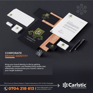
How We Design Logos at Carlstic
A logo communicates for the company, and Carlstic allows brands to be seen and heard. Our logo designing approach is efficient and has proven the ability to serve our clients’ interests. We create memorable and unique logos.
Purpose: We listen to the purpose of your company. What is your identity, and what are you looking forward to achieving? Your company’s story helps us understand how we will match your needs and create a strong company identity for you.
Sketch: Once we have identified your mission and are conversant with your story, we give you an opportunity to grant us a sketch of what you would like, and if you do not have a sketch in mind, we help you come up with one. With our experienced team of designers, we develop several sketches that articulate your story and refine it.
Develop a layout: We turn your sketch into reality by putting it in a digital format and giving your concept a life. We give it unique fonts which can stand out even without the symbols. We ensure that the logo matches the website and the colours represent your brand too.
Every logo Carlstic creates can be viewed under whatever format our clients prefer, whether print, website, or social media pages.

